
Making our nonfiction more browse-able: Part IV

One week of grad school and my word cloud nonfiction sign problem is solved.
The Problem: Our old signs were boring and no one used them
As you may remember from Part II in this series, our original nonfiction signs were boring and no one looked at them.
My first attempt to fix it: Handmade word clouds
Last spring, I experimented with changing out our standard Nonfiction signs with word cloud-based signs. My hope for these word-cloud based signs was to make it easier for students to find books they were interested in, without having to resort to using one of the library computers.
My new Word Cloud signs got attention, because a) they were new; b) I was careful to include the topics the students themselves told me they were interested in; and c) because I made sure that each sign had a few odd phrases on it to make it worth reading.

The problem with my new signs was that they took hours to make. I rolled them out as I completed them, and the new signs did appear to increase traffic. But as the school year came to a close, I was forced to choose how to spend the rest of my time. I could either:
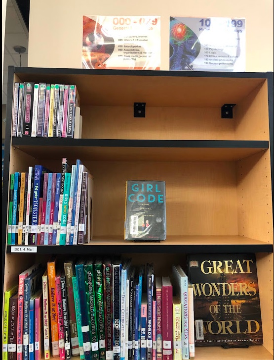
- rearrange the nonfiction section to fill gaps, eliminate the overcrowded shelves, and add more forward-facing books *or*
- make the rest of the signs.
In the end, I decided that rebalancing the nonfiction section would have a better chance of boosting circulation, so I chose to do that instead.
Grad school enters the chat
On the first day of grad school, our instructor asked us to introduce ourselves in an online discussion group by making a video, writing a little bio, making an infographic in Canva, or using WordArt.com to create a word cloud that captured a few things about ourselves that we were willing to share with the class. You can probably guess what I chose.
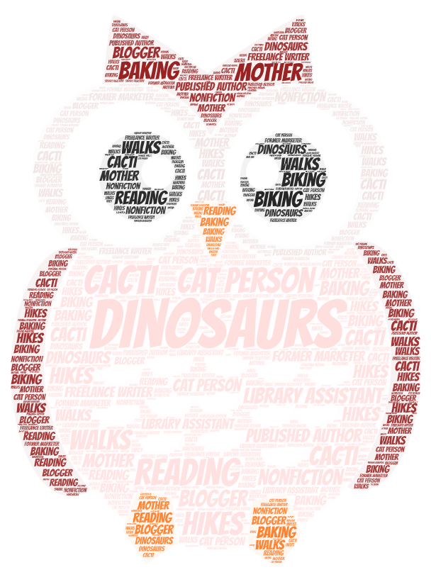
WordArt is frankly awesome, and now that I’ve used it, I’m more than a little embarrassed that I didn’t realize it existed last spring. This owl took maybe five minutes to generate, and I spent most of that time choosing a shape and picking words.
You can probably guess what happened next
Last Friday was my first work day of the new school year, and of course, I spent part of the day using WordArt to make themed word clouds for my new nonfiction signs.
I am very excited about these signs. Our old signage system had 10 signs, one for each century in the Dewey Decimal system. They were generic because they had to be.
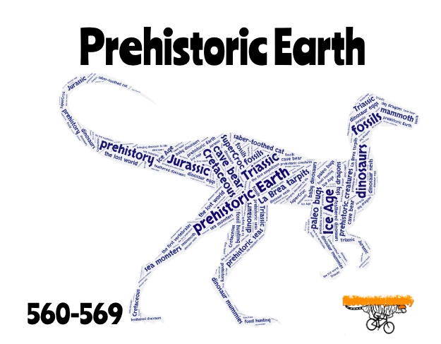
My new signage system includes 26 signs. I have made anywhere from 1-6 signs per century, depending on how large our collection in that area. This gave me a lot of flexibility in highlighting where popular books are. Wherever possible, I ditched the generic terms for the Dewey Decimal centuries and replaced them with terms that related to the books contained in that particular section of the library. For example, because our 500 section sprawls out across several bookshelves and covers a wide range of topics of interest to our students, I have created signs splitting out the 500s into “Science & Math,” “Earth Sciences,” “Life Sciences – Plants,” “Life Sciences – Animals,” and “Prehistoric Earth.”
I also did my best to pick word cloud shapes that reflected the primary topic in each section. I am hoping that using the shaped clouds will make my signs more visually effective, even from across the room. With any luck, the shapes will give you a pretty good idea of what you’ll find in a given bookshelf before you’re close enough to read any words.

Bonus: Finding shapes for these was a lot of fun.
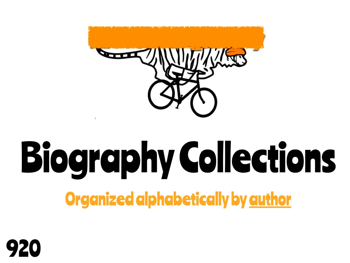
The 920 and 921 problem
One final note: I did not create fancy word cloud signs for our Biography (920) and Biography Collection (921) books, for a few reasons. First, we have already pulled those books out of the Nonfiction half of our library and moved them into a permanent home in our teaching area, so they are easy for the students to find already.
Second, the signs marking the Biography and Biography Collection sections already matched the rest of the signs we use in the teaching area.
Finally, identifying a shape to use for a word cloud in a section that is about people can become wildly problematic very quickly. In the end, I opted to leave the signs for our Biographies and Biography Collection just the way they were.
The students start school this week, so I’ll soon find out if these changes have any effect.
Related Links:
- Making our nonfiction section more browse-able: Part 1 (Caterpickles)
- Making our nonfiction section more browse-able: Part 2 (Caterpickles)
- Making our nonfiction section more browse-able: Part 3 (Caterpickles)

2 Responses to “Making our nonfiction more browse-able: Part IV”
[…] Making our nonfiction section more browse-able: Part IV (Caterpickles) […]
LikeLike
[…] Making our nonfiction section more browse-able, Part IV (Caterpickles) […]
LikeLike