Making our nonfiction section more browse-able: Part II

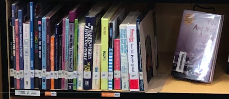
A stack of books from our nonfiction section that our students found & read because we put them on display somewhere else. (Photo: Shala Howell)
As I mentioned last time, my current obsession is finding ways to make our nonfiction section feel more like the nonfiction section in a bookstore, and less like an inscrutable wall of books organized by arcane numerical wizardry.
My first attempt at this involved labeling the sections of nonfiction that included books about topics that are often important to teenagers, but that they don’t always want to ask adults for help finding books about: mental illness, drug use, LGBTQ+ issues, puberty, divorce, grief, that sort of thing.
I made Life Topics lists to post on the walls and added little matching orange labels to the shelves highlighting sections that contained books about each topic.

Encouraged by the signs of new chaos in the nonfiction section generated after I posted these signs, I decided to continue experimenting with our nonfiction signage.
Our current nonfiction signs were adequate, but bland
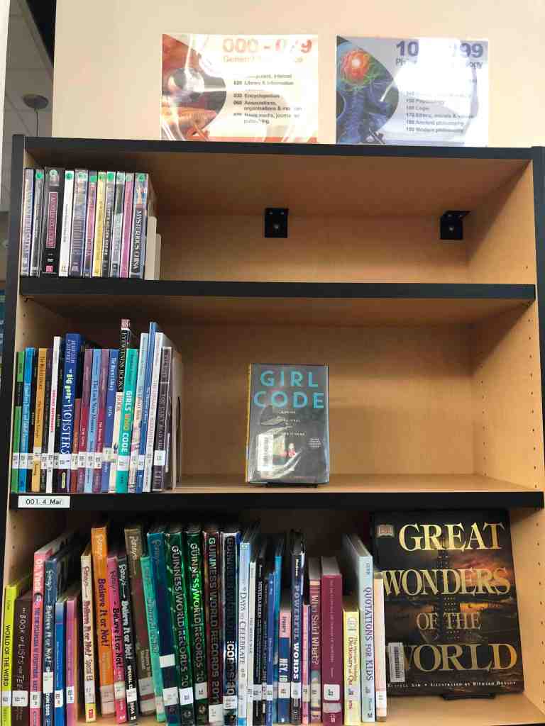
Our library uses a standard set of Dewey Decimal Explainer signs to mark where one section ends and the next begins. Each sign tells you the number of the section, its overarching subject matter, and lists five or six topics that you will find there. As far as I can tell, they are perfectly adequate and super easy to ignore.

All of the signs in our nonfiction section looked more or less like these. The colors of the CD-ROM label like art on the left changed with each section, but the general style was the same. No wonder they were exiled to the top of the bookshelves. There was little information of use on them other than the big century markings (000-099, etc.) anyway.
What if I swapped out those signs for ones that did a better job of highlighting the more interesting books in each section?
During the second half of the year, I experimented with replacing some of the signs in the nonfiction section with word clouds that highlighted the more interesting topics on that bookcase. My new signs were word-heavy and needed to be placed where they could be read, so I moved them down from the top of the bookcases to live next to the books they described.
These signs, which I generated in Google Slides using words pulled from the titles of the more interesting books included in that section of the nonfiction stacks, took forever to make.
And yes, I know that there are word-cloud generating programs available online. I tried feeding a list of titles from our nonfiction stacks into a few of them to see what would happen. I hated basically everything about the results. It was hard, if not impossible, to control which words were picked for the clouds, and the word clouds themselves looked anemic.
In the end, I decided it was better just to make the slides myself in Google Slides, so that I could control the wording, the font, the spacing, and the relative sizing to highlight topics that I was pretty sure would appeal to my patrons.
Even though I only ended up having time to make and place three or four of my new signs, I left those signs in place for the remainder of the school year to see what would happen. I did notice that books located close to one of my new signs began getting checked out.
Was the newfound popularity of our collection of books on the Salem witch trials due to my awesome new sign? Or was it the result of some student-choice research project happening that I didn’t know about? Impossible to say.
But I liked the look of the signs and the occasional sight of students reading them, so if time permits, I will make more of them to brighten up our nonfiction section next year.
In the meantime, what if I rebalanced the nonfiction section to make better use of the shelf space and give the shelves as many forward-facing books as possible?
Over the year, I noticed that the forward-facing books in our fiction stacks are the books most likely to be checked out on any given day. Looking at our nonfiction stacks I noticed a few things:
- Some of our shelves were completely full of densely-packed spine-out books
- Other shelves were mostly or entirely empty.
- In nonfiction, as in fiction, the forward-facing books were most likely to be checked out.
My contract with the district calls for me to work six days after school is out to prepare the library for the summer and begin making improvements for next year. I decided to use that time to rebalance the nonfiction shelves and see if I could make the section feel more browse-able and welcoming by increasing the number of forward-facing books we had on display.
To do this, I:
- Measured the total available shelf space
- Measured the empty shelf space
- Did math
- Marked all of the nonfiction shelves with masking tape at the average target fullness
- Starting moving books around with the goal of creating enough space on each shelf to put two books on display on each shelf
- Relabeled everything
My daughter, who generously gave up her first week of summer to help me, is basically the only reason I was able to get all of this done.

I think it looks better. In an ideal world, I would have liked to have done a more dynamic shelving approach like this one, but we didn’t have enough display holders, bookends, or time to get it done. As it was, it took every holder, bookend, and minute we had to do this much.
Will it make a difference?
Maybe?
My daughter, who redid all the labels for me, kept getting trapped by the face-out nonfiction books. So maybe?
We’ll find out in the fall.
Next week: How I’m planning to use the front half of the library to drive traffic to the back (where the nonfiction is).
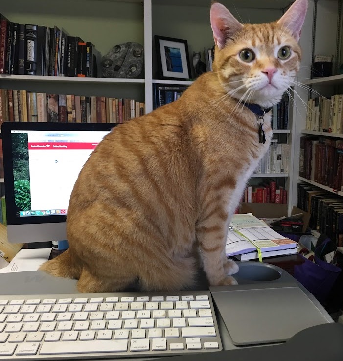
In the meantime, my cat would very much like me to know that it’s time to have a snack.

What about you?
- Librarians, what ideas do you have for boosting your nonfiction circulation?
- Readers, what would help make nonfiction sections feel more accessible and browse-able to you?
I would love to hear your thoughts.
Related Links:
- Embracing dynamic shelving (Don’t Shush Me)
- Making our nonfiction section more browse-able (Caterpickles)


4 Responses to “Making our nonfiction section more browse-able: Part II”
[…] Making our nonfiction section more browse-able: Part II (Caterpickles) […]
LikeLike
[…] Making our nonfiction section more browse-able: Part II (Caterpickles) […]
LikeLike
[…] As you may remember from Part II in this series, our original nonfiction signs were boring and no one looked at them. […]
LikeLike
[…] Making our nonfiction section more browse-able, Part II (Caterpickles) […]
LikeLike